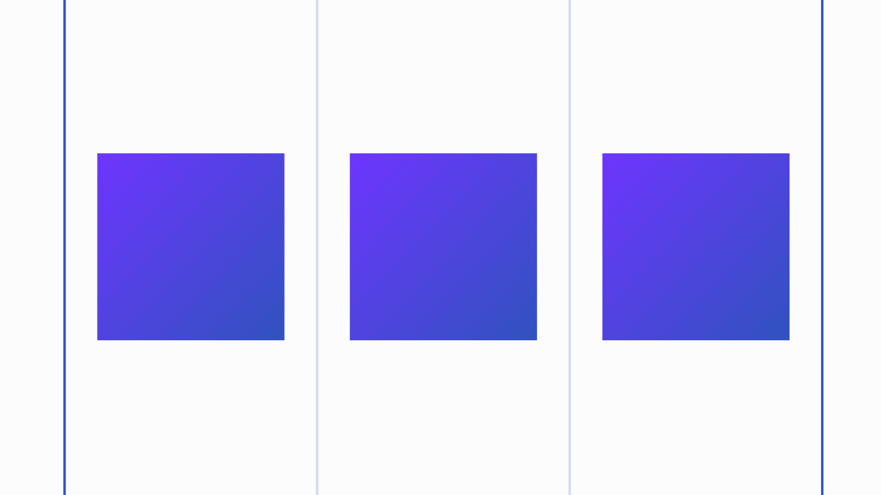
Image Grid
Here’s a quick tip for creating a equal sized image grid in HTML and CSS. There are two legit ways to accomplish this pattern, and both ways use the same HTML. I’ve limited the output to eight items for example purposes, but this technique will theoretically work for infinity items.
<div class="collection">
    <ul class="img-grid">
        <li>
            <figure>
                <img src="https://expressionengine.com/asset/img/learn/example.png">
            </figure>
        </li>
        <li>
            <figure>
                <img src="https://expressionengine.com/asset/img/learn/example.png">
            </figure>
        </li>
        <li>
            <figure>
                <img src="https://expressionengine.com/asset/img/learn/example.png">
            </figure>
        </li>
        <li>
            <figure>
                <img src="https://expressionengine.com/asset/img/learn/example.png">
            </figure>
        </li>
        <li>
            <figure>
                <img src="https://expressionengine.com/asset/img/learn/example.png">
            </figure>
        </li>
        <li>
            <figure>
                <img src="https://expressionengine.com/asset/img/learn/example.png">
            </figure>
        </li>
        <li>
            <figure>
                <img src="https://expressionengine.com/asset/img/learn/example.png">
            </figure>
        </li>
        <li>
            <figure>
                <img src="https://expressionengine.com/asset/img/learn/example.png">
            </figure>
        </li>
    </ul>
</div>
I’ve used a div.collection as a wrapper which is unnecessary for this example, but is a good practice. Allowing you to have multiple grids in a single HTML document that can be targeted individually.
I’m a big proponent of ITCSS, and an object oriented approach to CSS. Here is the object LESS for this grid.
.img-grid{
    list-style-type: none;
    margin: 0;

        li{
            margin-bottom: 20px;
        }

        figure{
            margin: 0;

                img{
                    max-width: 100%;
                }
        }
}

// responsibility
@media screen and (min-width: 414px){
    .img-grid{
        margin: 0 -10px;
        overflow: hidden;

            li{
                box-sizing: border-box;
                float: left;
                padding: 0 10px;
                width: 50%;
            }
    }
}

@media screen and (min-width: 750px){
    .img-grid{
        li{
            width: 33.33%;
        }
    }
}

@media screen and (min-width: 1200px){
    .img-grid{
        li{
            width: 25%;
        }
    }
}
This gives us a single column stack, that expands to two columns, then three and finally four columns at max width. You can adjust the math to work however you like, but I’ve found this to be pretty universally useful, and visually pleasing at all breakpoints.
You can demo and play with this code here: https://jsfiddle.net/jmathias/6kbjw0ft/
But this is old school code I hear you cry! Well, sure, I suppose. If you prefer cutting edge you can accomplish the same exact grid with this flex-box code instead.
.img-grid-flex{
    display: flex;
    flex-wrap: wrap;
    list-style-type: none;
    margin: 0;

        li{
            box-sizing: border-box;
            // grow shrink basis
            flex: 0 1 100%;
            // allows incomplete rows to grow as needed.
            // flex: 1 0 100%;
            margin-bottom: 20px;
        }

        figure{
            margin: 0;

                img{
                    max-width: 100%;
                }
        }
}

// responsibility
@media screen and (min-width: 414px){
    .img-grid-flex{
        margin: 0 -10px;

            li{
                flex-basis: 50%;
                padding: 0 10px;
            }
    }
}

@media screen and (min-width: 750px){
    .img-grid-flex{
        li{
            flex-basis: 33.33%;
        }
    }
}

@media screen and (min-width: 1200px){
    .img-grid-flex{
        li{
            flex-basis: 25%;
        }
    }
}
As you can see the code isn’t much different, just another way to accomplish it. The upside of display: flex is that you don’t need to use floats, or float clearing methods. Additionally, you can have flex box do the math for you and display incomplete rows with larger images. You just need to change flex: 0 1 100%; to flex: 1 0 100%;.
You can demo and play with this code here: https://jsfiddle.net/jmathias/ox70d053/
So there you have it. A nice simple Image grid you can use on your ExpressionEngine CMS site today!
Comments 0
Be the first to comment!